

Summer reading list 2023/24

Richard Montgomery
8 minutes reading time
Related articles


Better investing starts here
Get Betashares Direct
Betashares Direct is the new investing platform designed to help you build wealth, your way.
Scan the code to download.
Learn more
Learn more
The SPIVA scorecard comes of age this year. For 21 years it’s been the go-to report for investors and others interested in the ‘active vs. passive’ debate. With more than two decades of data to refer to, let’s look at what we can learn from these reports.
What is SPIVA?
SPIVA stands for ‘S&P Indices versus Active’. The SPIVA reports are published by S&P Dow Jones Indices, a division of S&P Global. Their primary purpose is to inform the ‘active vs. passive’ debate, by providing data on how actively managed funds around the world have performed, over both the long and the short term, against appropriate benchmarks.
The two main reports that are produced are:
The SPIVA Scorecards – provide data on the performance of active funds against relevant benchmarks. Reports are provided for markets around the world, both equity markets and fixed income markets. They are broken down into categories according to the type of fund, to ensure the appropriate benchmark is used – for example, large, mid or small-cap funds.
The SPIVA Persistence Scorecards – measure the consistency of a fund’s performance relative to its peers. In other words – are funds that outperform in a given period able to maintain that outperformance in subsequent periods? This Scorecard is designed to address the question of whether outperformance is the result of skill (in which case outperformance would be expected to persist over time) or luck (in which case outperformance would be expected to be more random).
What do the results tell us?
The SPIVA data tells a remarkably consistent story.
According to Craig Lazzara, Managing Director, Core Product Management S&P Dow Jones Indices: “Our very first SPIVA Scorecard reported that most active managers had underperformed a benchmark appropriate to their investment style over a full market cycle. Our most recent SPIVA update reports more or less the same thing.”
The first SPIVA Report covered the US equity market only. The chart below shows the percentage of large-cap US equity funds underperforming the S&P 500 each year since then.
Percentage of Large-Cap Domestic Equity Funds Underperforming the S&P 500 Each Year
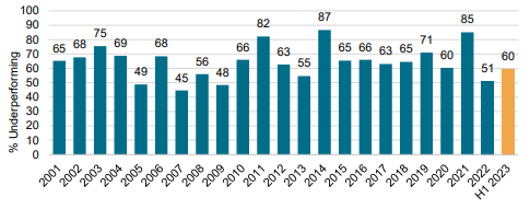
Source: S&P Dow Jones Indices LLC. Data as of 30 June 2023. Chart is provided for illustrative purposes. Past performance is not indicative of future performance.
Since the first report, SPIVA has expanded to nine different geographies, and now reports on the performance of over 100 different active fund categories around the world.
A consistent theme of SPIVA Scorecards over the years has been that underperformance rates generally rose with the length of the period in which performance was measured.
The table below shows the percentage of active Australian and US equity funds that have underperformed their relevant benchmark.
| Time period | ||||
| 1 year | 3 years | 5 years | 15 years | |
| US Large Cap Funds underperforming | 60.9% | 79.8% | 86.6% | 92.2% |
| Australian General Equity Funds underperforming | 76.5% | 69.3% | 77.6% | 85.4% |
Source: https://www.spglobal.com/spdji/en/research-insights/spiva/. US Large Cap Funds are compared to the S&P 500 Index, Australian General Equity Funds are compared to the S&P/ASX 200 Index. Past performance is not indicative of future performance.
Good luck or good management?
The disclaimer “Past performance is no guarantee of future performance” is included in material on all funds offered to investors (including our own). What this is basically telling potential investors is just because a fund, or fund manager, has produced good results in the past, this doesn’t necessarily mean they will do so in the future.
However, past performance tends to be one of the first things that potential investors look at when deciding whether to put their precious savings into an investment. Human nature is such that – while the lawyers are telling us not to count on it – we tend to be biased towards funds that have done well in the past.
With index tracking funds, there is no decision to be made around the ‘skill’ of the fund manager, as the manager is simply aiming to replicate the performance of the index (before fees and expenses). If the index does well, so too does the fund; if the index performs poorly so too does the fund.
This is not the case with the active fund manager, who typically aims to do better than the index – and in doing so, justify their active management fee.
For this exchange (fees charged for the fund manager’s skill) to be justified, any outperformance has to be the result of that ‘skill’, rather than luck. And if it is the result of skill, then that outperformance should persist over time. If it doesn’t, that indicates that chance is playing a part in the proceedings.
So – what does the data tell us?
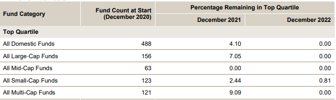
The SPIVA Persistence Scorecards show the percentage of funds that remain in the top-quartile or top-half rankings over consecutive three- and five-year periods.
The US Persistence Scorecard Year-End 2022 found that of 2020’s top quartile large-cap funds, none continued in the top quartile for the next two years and only 5% of the above-median large-cap active equity funds in calendar year 2020 remained above median in each of the two succeeding years.
The report also looked at the top 50% of domestic equity funds in the 12 months ending 30 December 2018, and their performance over the subsequent three years. It found that among all domestic equity funds, there was a 0% chance of a top half performer, as of 31 December 2018, still being a top half performer as of 31 December 2022.
Performance Persistence of US Domestic Equity Funds over Three Consecutive 12-Month Periods
Source: S&P Dow Jones Indices LLC, CRSP. Data as of December 31, 2022. Chart is provided for illustrative purposes. Past performance is not indicative of future performance.
Turning to the Australian market, the most recent data show that 77% of ‘Australian Equity General Funds’ underperformed the S&P/ASX 200 in 2023. This was the second-worst result for active managers since the beginning of the data in 2009.
Percentage of Australian Equity General Funds Underperforming the S&P/ASX 200 Each Year
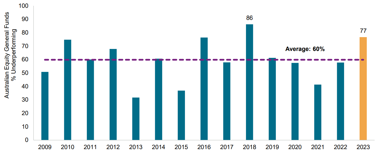
Source: S&P Dow Jones Indices LLC, Morningstar. Data as of Dec. 31, 2023. Chart is provided for illustrative purposes. Past performance is not indicative of future performance.
Looking at longer timeframes, the story is similar. In every category with a 10-year history, 75% or more of the funds underperformed their benchmark.
Percentage of Underperforming Active Australia and New Zealand Funds
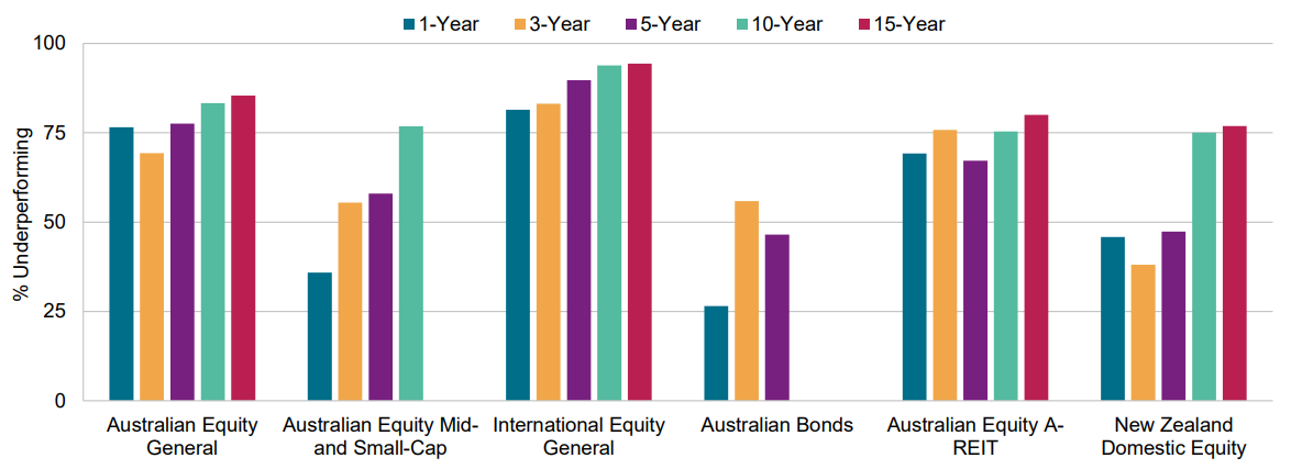
Source: S&P Dow Jones Indices LLC, Morningstar. Data as of Dec. 31, 2023. Past performance is not indicative of future performance. Chart is provided for illustrative purposes. Underperformance rates for the Australian Equity Mid- and Small-Cap and Australian Bonds categories are reported for time horizons over which the respective benchmark indices were live.
The Australia Persistence Scorecard (December 2022) showed that 6.25% of Australian equity funds in the top quartile as of 30 December 2021 remained there at 30 December 2022, while none of the funds in the International Equity, or A-REIT categories remained there.
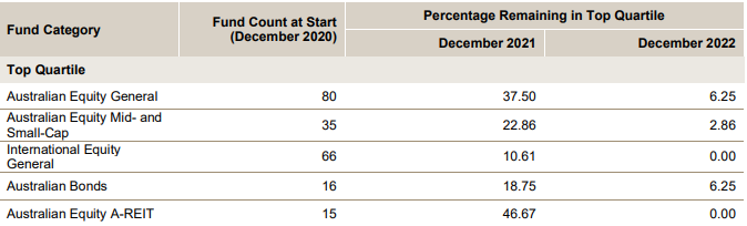
Source: S&P Dow Jones Indices LLC, CRSP. Data as of December 31, 2022. Chart is provided for illustrative purposes. Past performance is not indicative of future performance.
The conclusions, which SPIVA states are ‘robust across geographies’, include:
- Most institutional managers underperform most of the time.
- The tendency for underperformance typically rises as the observation period lengthens.
- When good performance does occur, it tends not to persist. Above-average past performance does not predict above-average future performance.
How do investors see the active/passive question?
It’s impossible to know how many investors are influenced by the data presented by SPIVA over the last two decades. However, what is unarguable is that investors are increasingly favouring passive exposures over active ones.
The chart below shows cumulative US fund flows from 2000 to August 2022 into active and passive funds. Since 2014/5, it’s clear that money has been pouring into passive funds.
The chart below shows historical fund assets in US funds from 1993 to into active and passive funds.
Historical Fund Assets: Active vs. Passive
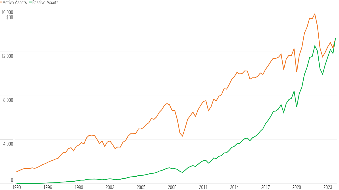
Source: Morningstar Direct Asset Flows. Data as of Dec. 31, 2023.
For more detailed information about SPIVA and the Performance reports, please refer to https://www.spglobal.com/spdji/en/research-insights/spiva/
Explore
Special reports
10 comments on this
Holey Moley! No contest!
Very good research and very good article setting out conclusions based on research. But I always find the conclusions difficult to understand. Surely if a highly intelligent person, highly qualified in finance and with 20 or more years of relevant experience looks through the list of securities in an ETF, he will be able to pick out some and say “these are duds and never going anywhere, let’s get rid of them” and also say ” there are a number of high-performing sure-bets that should be in here”, surely the new list of securities would have a high probability of out-performing the ETF?
First if all thank you for the report !
I think the most interesting point from the data is that better performing funds can’t maintain this over a 2 year or longer period. This makes a very strong argument for index funds.
1). a savvy investor can own a 20 stock portfolio of large caps that outperforms the ASX200 index as I have done. why own rubbish like AMP, Telstra, QBE, Boral etc.
2) the one area of the market that has a track record of outperformance is Australian small cap managers. I own several of them. Have a look at Smallco ( 14% p.a after fees over 20 years ), Ausbil microcaps ( 16% p.a over past 10 years ), Mirrabooka, WAM microcaps, Hyperion small growth companies ( 14% p.a over 20 years ).
I wouldn’t touch a small cap index fund with a barge pole as there are so many profitless companies in the small cap space that should be avoided.
Two of my ETFs are showing a profit, two are not. Only two of my 17 direct stock picks are in profit!
I’m no wizz-kid, yet even my rudimentary research showed similar. And yes, I always look at the past to follow the track record. Thanks Richard, concise, informative, and understandable.
Compelling and consistent over 20 years. Is this Active v. index comparison true over even longer periods? I’d like to see it back to 1970’s – to see more market cycles. Also, what of the role of price discovery, who needs to do it? and who needs it?
If the majority of large funds are underperforming the benchmark, and passive funds simply mirror it, then given these funds likely represent collectively a large percentage of all trading, then does that mean a huge number of ‘ Mum and Dad’ investors are outperforming the market? After all, not everyone can underperform the benchmark.
Summary – Stick to ETFs as the stock pickers may have good years here and there but in long run wont outperform the ETF. Good luck
Interesting but perhaps not entirely surprising!
Active funds also need to (should!) work harder because some of the profits are eaten up by the higher fees they charge.
One of the charts shows 2018 to 2022 which covers very challenging market conditions when part of the rulebook was thrown out but this is exactly when the fund managers should earn their money and turmoil always creates opportunities. Besides, when is the market just plain old normal??!